Tuesday, September 29, 2009

finished piece, critiquing our art

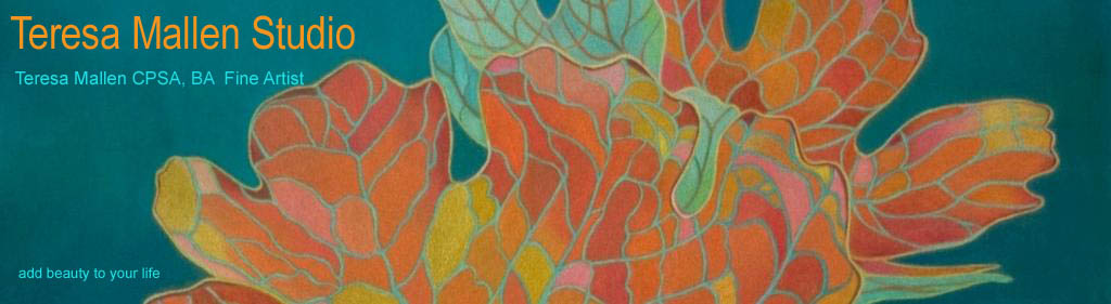
Red Petal Peony, 5 3/4" x 15 1/4", coloured pencil on Stonehenge
Copyright Teresa Mallen

It has been a while since you have seen this one as a work in progress. Here it is finished. You might recall that in the past I talked about not being one to work in a series. I had hoped to attempt a series of large, simplified and somewhat abstracted rose pieces. Well, I finished two and then I got distracted by peonies. So here are the four below...The rose pieces are my favourites and I think I will do another one some day. That would make three for the rose series. For now, I guess this is the 'petal series'. :-)


When I returned from the CPSA's convention in Atlanta, I mentioned that I would write about a workshop I attended. Well, it has been a while but what the heck...

The workshop involved watching a mock jury in action. Three distinguished cp artists: Jeffrey Smart Baisden, Elizabeth Patterson and James Mateer made up the panel of judges and the moderator of the workshop was CPSA founder, Vera Curnow. The art being juried was from 25 submissions for a non-CPSA show. There was a variety of styles, subject matter and media. The neat thing about this workshop is that as the jurors examined the projected images, they spoke their thoughts about each piece into their microphones allowing those of us in the audience to watch and listen to the process.

So what are judges looking for? Is there anything here that we can use when reflecting upon our own work?

First of all, it seemed that factors like composition, handling of values and edges, drafting skills etc. were expected to be executed well. Of course it got their attention when they weren't executed well but the judges were looking for more than technical ability. What each judge articulated time and again, is that they were looking for something that "gave impact at first glance". Originality was a big plus. Was there an emotional response?

Work that was well executed was dismissed on the grounds that work like it had been "seen a thousand times". Sentimental work or work that was "too sweet" and "warm and fuzzy" was readily dismissed.

The judges were also looking for consistency in a painting. Was the artist technically consistent across a piece and was there balance? Was there a sense of 'wholeness'? Elizabeth was very turned off by bold colourful signatures. They were too distracting. James often referred to any technical glitches that he saw (as he said, "Don't show what you don't know") and he seemed to focus on the design of a piece and he looked for movement.

Jeffrey commented a few times that the artist needed to do more than record information, she "wanted to be moved". She also stated that she wanted "punch, impact" and "something that would jar my teeth"! Elizabeth commented on how the artist "shouldn't make it a chore for your audience to figure it out". Again and again the panel referred to the mood of a piece, did it make them curious, did it make them want to think about it, was it compelling, was it thoughtful, was there emotion?

Ultimately, whether the piece was a pastel or an oil or an abstract or a traditional painting, what the judges were looking for was to see what the artist was trying to say. What was the point of their art? They commented that the artist should be able to convey why they are doing what they are doing.

This was a very intriguing event to watch unfold. I found their views insightful into the process of jurying. Perhaps their comments will give you something to ponder the next time you head to the studio. What are you trying to say? What is the point of your art? Is your art original, compelling and does it convey emotion?

Of course there is also the reality that work that sells is often sentimental and has been seen a thousand times before! :-) I recently read a comment on artist Aili Kurtis's website and I quote: "Human perception of what is good or bad varies from human to human and from one culture to the next." Think about what has been thought of as good art or bad art over the past few hundred years in Western culture...humm...perceptions do shift and change. For now, I am just going to focus on whether or not my next piece might just jar someone's teeth!

And now for my favourite garden plants, brown eyed susans and purple coneflowers. I transplanted these as small clumps from my former home two years ago. They are spreading and thriving beautifully.


And oh the apples I am getting this year off our elderly apple tree. I am busy these evenings cooking up apples (with butter, cinnamon, nutmeg, allspice, ginger, lemon juice and brown sugar) to store in the freezer. Absolutely yummy with french toast and pancakes.

Friday, September 11, 2009

drawing with a grid, staycations, more studio pics

Welcome to the National Gallery of Canada! There are many reasons why I love living in Ottawa and this gallery is one of them. Last Thursday evening, I had a bit of a staycation. I attended a special exhibit and I decided to take my camera along so you could see this wonderful gallery.

The collection of art that makes up the permanent collection exhibited in many locations until this new facility was built in 1988. Architect Mosha Safdie designed this award winning glass and granite building and it truly is stunning. The above pictures show the front entrance and the photo below shows a side view.

Next is a shot taken right into the setting sun. :-) Oh well, it was going to be dark when I left the exhibit so it was now or never. This is the other end of the gallery which faces the Ottawa river.

The next picture shows the area just as you approach the entrance to the gallery. 'Maman' is a fabulous 30 ft high sculpture by artist Louise Bourgeous. The bronze spider even has marble eggs in her sac. Across the road, you can see another fabulous piece of architecture, the Notre Dame Cathedral Basilica. It is absolutely incredible inside.


The picture below shows a lovely view of Canada's parliament buildings, taken from inside the gallery.


Here is an interior shot and the door under the artwork is where I walked into the exhibit I went to see. The exhibit was titled 'From Raphael to Carracci, The Art of Papal Rome'. This three month exhibition, here at the National Gallery, was the only venue in North America. There were 150 drawings and paintings by 16C masters such as Michelangelo, Raphael, Giorgio Vasari, Titian and Carracci. All I can say is wow. What a treat to see this work. This brings me to the part of the title that mentions drawing with a grid.

Over the years that I have been teaching art, I have been amazed to often hear students remark that they can't really draw because they use a grid. Some refer to it as cheating or they will say that this is how they know they aren't really artists. I wonder if they would consider Raphael a real artist? The man used grids all of the time!!! This exhibition had many drawings by these masters that had carefully rendered one inch grids covering the page. One Raphael drawing showed a preliminary sketch of a horse. He made several mathematical notations on the page noting distances and proportions, from the front leg to the hip, the girth of the belly to the neck etc. Are these sorts of math equations wrong too? Soooo...if you are someone who uses a grid in order to help you draw, please don't think this is a really bad thing to do. Artists use many tools. Besides, you still have to get the bits you draw inside each grid right. Grids will only assist you so far. :-) Relax, stop feeling guilty and realize you are in excellent company!

My next photo is my last gallery picture. It shows a walkway heading back down to the main entrance.

So what is going on in your city? When was the last time you went to a show at your local gallery? Even if you live in the country, most folks live within an hour or two of a city. If you don't have a grand gallery like this to go to, you will find that browsing a small private gallery can really stir up your creative juices. Why not plan a staycation this fall? I know that I shall be heading back to the National Gallery soon as I want to see the permanent collection again. Oh, and I saw some art books in the gallery bookstore that would make perfect Christmas gifts. I like to save my husband the bother of shopping! :-)


From the sublime to the ridiculous. For those of you who enjoyed seeing my studio (pics in previous post), I thought I would share how the room looked two years ago when we moved here.

I'm thinking ugly mock Tudor??? Ugly something anyway...


You might recall that we are currently painting the dark brown siding on the exterior of the house. Well two years ago, as soon as we had the keys to the house, I rolled up my sleeves and started to cover up all of this dark brown. I had a deadline as I was scheduled to teach a course in this room in just a few weeks. The paint on the floor was barely dry and my husband made new tables the night before. I didn't get the track lighting added until later.

Here is another shot of the studio now...ah, much lighter and brighter...

You can click on this studio pic for a larger image. So, tell me - where are you going to staycation this fall? (Can you believe such a word was even created?)

Thursday, September 3, 2009

new course dates and studio pictures

We all love seeing where artists work don't we? Here are a few pictures of my studio. I teach in my studio as well and the picture above shows how my studio looks when I teach, all nice and tidy. I set it up with more tables and chairs but you get the idea. You can click on the pics for a larger image.

I have added new dates for my Coloured Pencil Basics course. The course will run Saturday mornings from October 24th until November 7, 2009. This is a great introduction course as it provides everything you need to know in order to 'paint' with coloured pencils. Students learn how to correct mistakes, how to create colours on the paper and they experience the difference it makes when working on different papers and surfaces. Also covered are stroke techniques, how to burnish cp pigment so it looks like paint, and much more. For more information or to register, please see my website, or click here.

Below is a picture of how my studio looks right now...not so tidy, but hey I'm working!! :-)

In the next photo, may I draw your attention to the lovely green chair on the left? You might recall that I discovered several old chairs in the attic of my parents' farmhouse. This poor thing was covered in pigeon poop and the arms and legs were discoloured from water damage. After a good scrubbing and after applying some wonderful wood refinishing products, I have a lovely chair. One down, three other chairs to go. One chair is a lovely antique rocker that is broken (nothing modern carpentry glue and some clamps won't mend) and one is an elegant antique chair with a woven rush seat (You guess it, the woven seat is broken. I have discovered a small local company that does this sort of restoration and they also sell kits to repair such seats should I get inspired to fix it myself.) The third chair is a rose coloured one that matches the green one in the picture. I am not sure where all these chairs are going to go in my house but I couldn't see them get hauled away as garbage.

I am leaving the bliss of my studio this afternoon in order to do some advertising and to enter the bliss of the National Gallery of Canada. I am participating in a studio tour in November. The brochures have just arrived from the printers so I am heading out to drop 400 of them off at the Council for the Arts in Ottawa. They do quarterly mailings, so thanks to this service, these brochures will end up in the hands of some movers and shakers in the city. After that I am heading off to see a special art exhibit. I am a blessed gal!